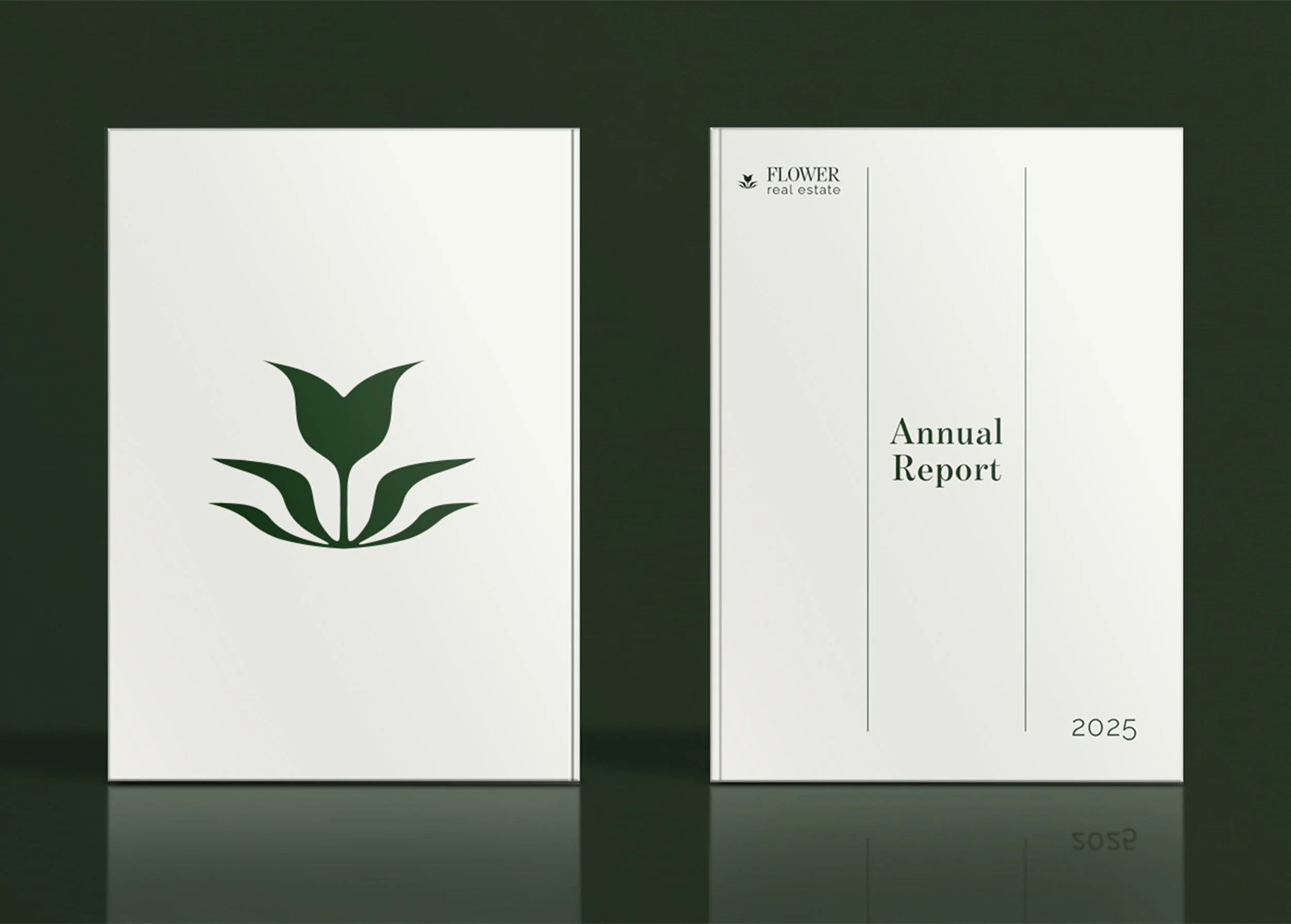
Flower Real Estate
Project Type: Brand Identity
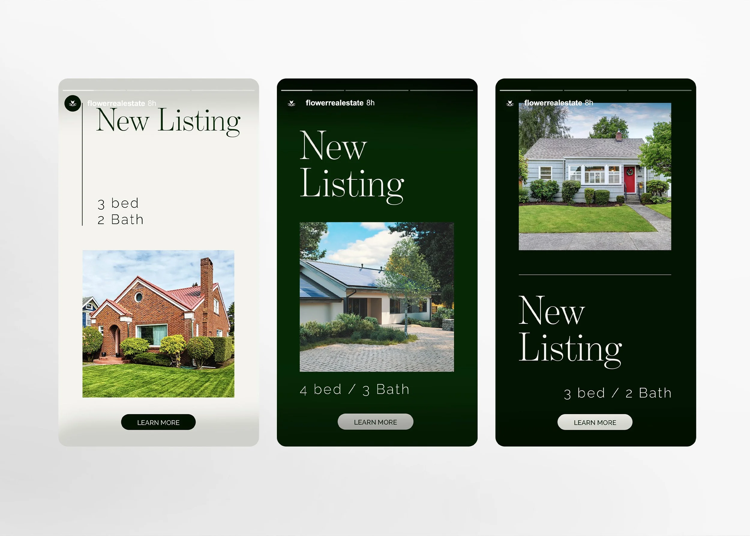
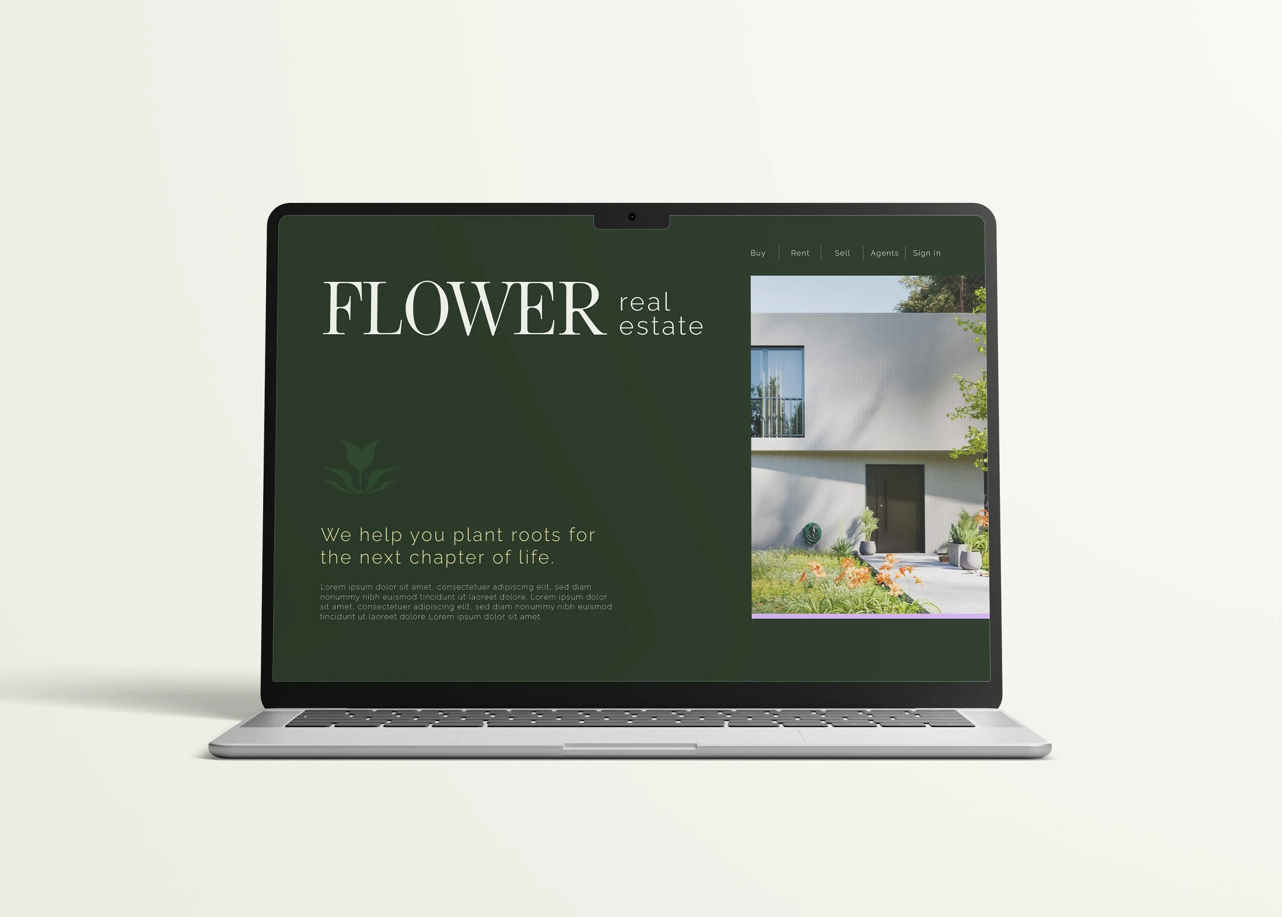
Flower Real Estate does more than just sell homes, they sell a stepping stone into a new chapter of life allowing it’s clients to place roots and create a home. This client came to me to activate their brand visually and together we created an identity that was timeless and sophisticated — appealing to the majority while retaining a slightly feminine flair.
The client’s last name, Flower, was visually strong and the perfect crux from which to launch the brand identity. The system is minimal and clean to endure the test of time and allows the real estate photography to serve as the primary visual element — balanced with a strong serif font that evokes a slight femininity, while being supported by a more subtle and strong sans-serif font that still retains a flicker of style and individuality.